![]() John Smith Legacy
John Smith Legacy ![]() Gradius Home World
Gradius Home World ![]() GameStone
GameStone ![]() Follow @JimStoneCraft
Follow @JimStoneCraft
Chris Hatzopoulos
Cliff Campbell
GameStone
GameStone Font
GeoSwordRX35
Kitty Bot (Alteka)
Konaken
Mr.AKANEfan
Ramas Place
Riccardo F
Ryan Genno
Shaun
SHI-MA Mimori
Synno Takana 1999
Unknown 01
Unknown 02
Unknown 03
Unknown 04
Unknown 05
Unknown 06
Unknown 07
Unknown 08
Here's a golden logo to celebrate the 40th Anniversary of Gradius.
29th May 1985 - 29 May 2025


Here are the six different wallpapers I've made for the 40th Anniversary of Gradius.
Don't forget to click to see the full resolution versions (3840x2160 UHD 4K).
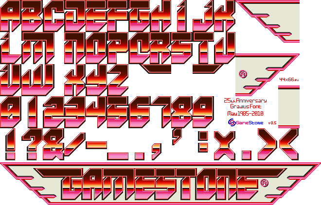
Here's the font sheet I made to celebrate the 40th Anniversary of Gradius 29th May 1985 - 29 May 2025.
This font is based on Gradius Origins Collection (GOC), as the original artwork didn't have the wings, I made a few coloured variants.
Here's the logo I've made to celebrate the 35th Anniversary of Gradius, it's called Gradius Wings 85.
29th May 1985 - 29 May 2020

I made sixteen different fonts for the 35th Anniversary of Gradius, so I decided to make a single sheet with all the logos and some extra text, I couldn't decide on a background colour from three I tested, so I've made all three available.
Don't forget to click to see the full resolution versions (3840x2160 UHD 4K).
Here are all sixteen font sheets I made to celebrate the 35th Anniversary of Gradius 29th May 1985 - 29 May 2020, these were then used to make the various logos from the Gradius series.
This font is based on the UK-US version of Gradius on the NES.
Here are some examples of what can be achieved with these fonts.
This font is based on Gradius Gaiden on PlayStation.
Here are some examples of what can be achieved with these fonts.
This font is based on Gradius IV Fukkatsu on PlayStation2.
Here are some examples of what can be achieved with these fonts.
This font is based on Gradius V on PlayStation2.
Here are some examples of what can be achieved with these fonts.
This font is based on Gradius Generations, Gradius Galaxies and Gradius Advance on the Game Boy Advance.
Here are some examples of what can be achieved with these fonts.
This font is based on Gradius III on the Super Famicom.
Here are some examples of what can be achieved with these fonts.
This font is based on Gradius III ~Densetsu kara Shinwa e~ arcade poster.
Here are some examples of what can be achieved with these fonts.
This font is based on Gradius II GOFER no Yabou on Arcade.
Here are some examples of what can be achieved with these fonts.
This font is based on Gradius 2 on the MSX.
Here are some examples of what can be achieved with these fonts.
This font is based on Gradius 2 on the MSX (Instruction Manual)
Here are some examples of what can be achieved with these fonts.
This font is based on the UK version of Nemesis on the Game Boy.
Here are some examples of what can be achieved with these fonts.
This font is based on Nemesis II and Gradius II on the Game Boy.
Here are some examples of what can be achieved with these fonts.
This font is based on the Japanese version of Gradius on the Game Boy.
Here are some examples of what can be achieved with these fonts.
This font is based on the small graphics on the MSX Gradius box and MSX Parodius front cover, it's also the logo used on the original arcade release of the game.
Here are some examples of what can be achieved with these fonts.
This font is based on the black and white manual graphics used in the MSX version of Gradius and Parodius.
Here are some examples of what can be achieved with these fonts.
I've adjusted quite a lot, added a lot more detail and change letters like the "i" to better match the other letters.
This font is based on the Arcade title screen logo for Gradius.
Here are some examples of what can be achieved with these fonts.
I was inspired to make this font due to the Game Over screen in the Xbox 360 game Otomedius.
Here's the original the Game Over message from Otomedius and my version below it.

Click the image below for the full size version.
I'm not too sure on the pink background, but I tried lots of colours and that one just fits, reminds me of pink chocolate for some reason.
Click the image below for the full size version.
Inspire by the title screen logo from Otomedius Excellent

Click the image below for the full size version.
This was a logo I made for the 25th Anniversary of Gradius.
29th May 1985 - 29 May 2010


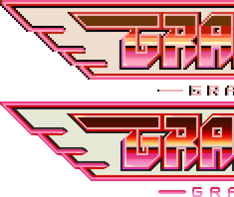
Just to show the work I put into the updated logo, here's the original logo and GameStone's updated logo zoomed in to 200%.
