![]() John Smith Legacy
John Smith Legacy ![]() Gradius Home World
Gradius Home World ![]() GameStone
GameStone ![]() Follow @JimStoneCraft
Follow @JimStoneCraft
Chris Hatzopoulos
Cliff Campbell
GameStone
GameStone Font
GeoSwordRX35
Kitty Bot (Alteka)
Konaken
Mr.AKANEfan
Ramas Place
Riccardo F
Ryan Genno
Shaun
SHI-MA Mimori
Synno Takana 1999
Unknown 01
Unknown 02
Unknown 03
Unknown 04
Unknown 05
Unknown 06
Unknown 07
Unknown 08
Here's a Konami Windy logo used on their arcade machines with the same name.


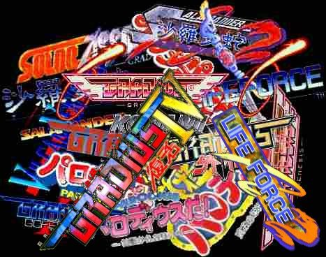
Over the years I've made a few special logos for the site including ones for various games made by Konami.



Otomedius G (Gorgeous!) Unofficial logo by GameStone.
I chose the 'G' position to be more in the middle because the word 'Gorgeous' has more characters than the Japanese Katakana version (9 vs 6), the 'G' was too hidden otherwise, plus it's closer to the tail of the letter 'M' making the layout more balanced.
I also chose not the have the halo effect at this time, this would be needed if it was going to be place on the title page like the title screen of the game.

Full Size Version - 3684x946px
Half Size Version - 1842x473px
Quarter Size Version - 921x236px
I'm disappointed with the logo used on the US release of the game and made my own version last year, I've now put together some box art of how it would look on the official release.
I also made some fake PS3 and PSP box art for the fun of it, note that the full size version are rather large.
Full Size Version - 2277x3458px - Full Size Version - 2405x3460px
Half Size Version - 1138x1729px - Half Size Version - 1202x1730px
Quarter Size Version - 569x864px - Quarter Size Version - 601x865px
Full Size Version - 2277x3457px - Full Size Version - 2405x3522px - Full Size Version - 2277x4014px
Half Size Version - 1138x1728px - Half Size Version - 1202x1761px - Half Size Version - 1138x2007px
Quarter Size Version - 569x864px - Quarter Size Version - 601x880px - Quarter Size Version - 569x1004px
I started designing these after Konami announced the US release of the game, mainly because the US official logo looks a bit rushed and boring, so here is my take on what the English should look like.
I've tried to make the logo in the same style of the Japanese original version shown below.
Now this should be the Official logo as I would say it looks great, very colourful and in the same style as the Japanese original.
Otomedius Excellent Unofficial logo by GameStone.
Moved the word 'Excellent' down and to the right as I did not like the way it over lapped the tail of the X hiding some detail, tweaked some of the shading.

Full Size Version - 4038x1134px
Half Size Version - 2019x567px
Quarter Size Version - 1010x284px


Otomedius Excellent Unofficial logo by GameStone.
Otomedius Excellent Unofficial logo by GameStone.
I updated the 'X' character as the first release looked more like an 'H', also redone the '!' (exclamation mark) as the star looked a little too small.
You will notice that the original Japanese logo has the top green colour only on the first character, so I decided to abandon this version and start from scratch as this was easier than editing this version.
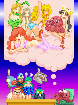
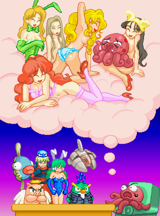
This is the image from the game intro.

Left image - Some detail is lost behind the table so I moved the table and Octopus down, then lengthen the table.
Right image - I added more cloud and put the rest of the sofa in that Octopus is sitting on.
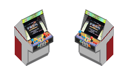
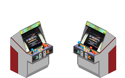
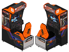
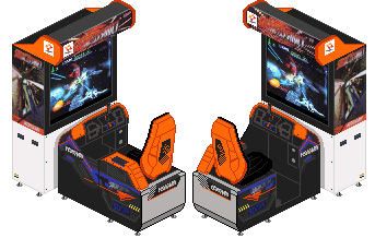
New Windy Machines and door.
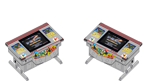
Based on GameStone's Windy icons (64px Versions).
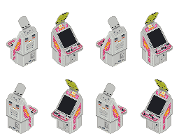
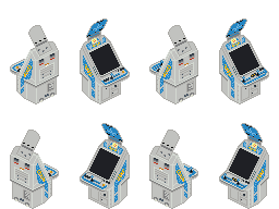
I'll add the instruction cards at a later date.
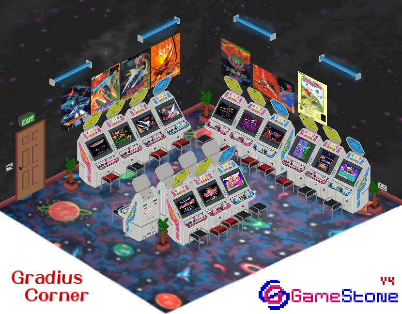
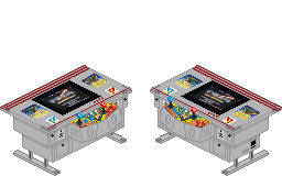
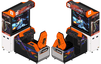
Added the new Salamander, Windy and Windy II machines, also put Salamander 2 in a Windy as it came out before the Windy II was available.
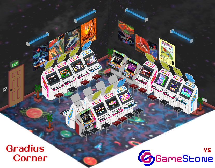
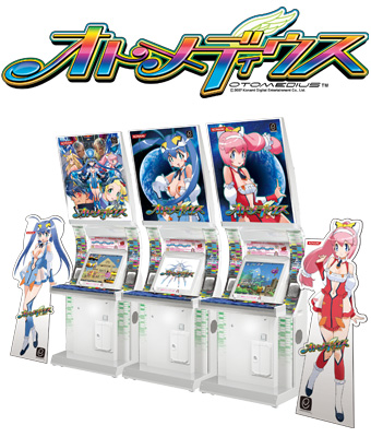
Added the new Salamander Cocktail and Otomedius machines.
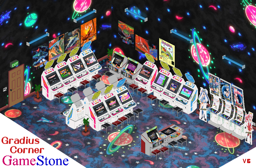
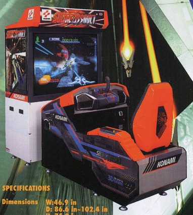
Added Solar Assault.
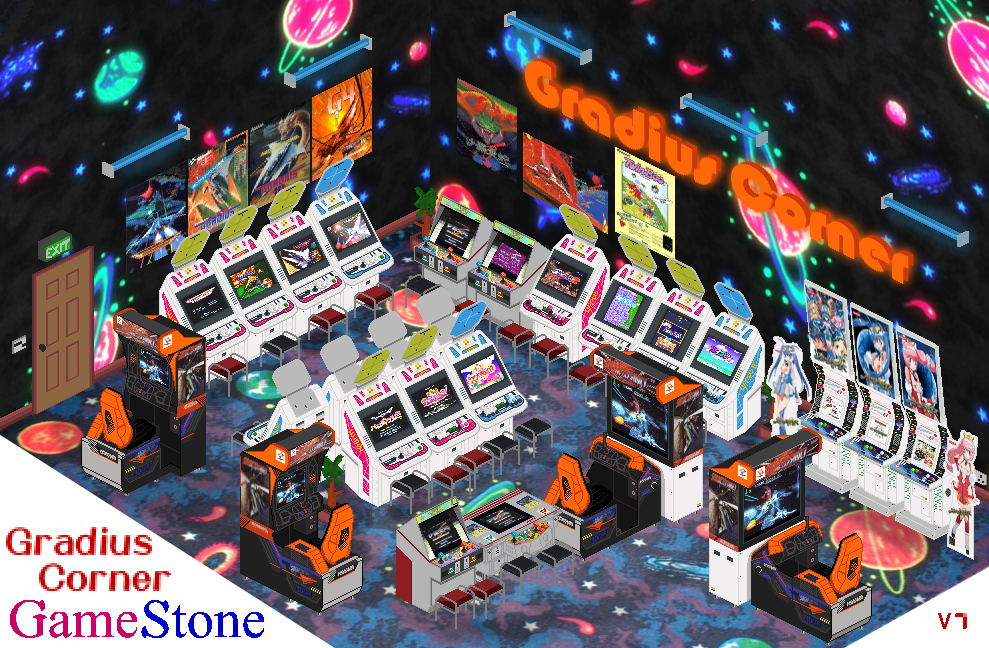
Moved the arcade around for better spacing.
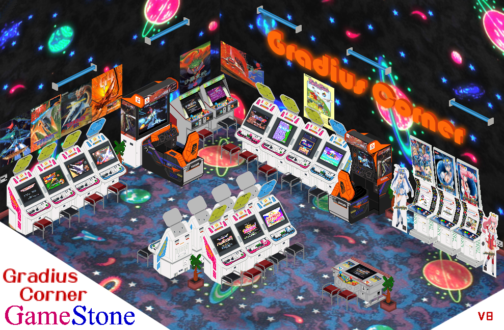
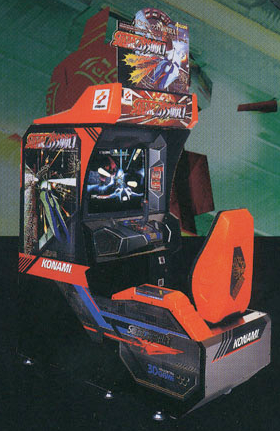
Konami has made a few different arcade machines over the years, in 1996 they released the Konami Windy コナミ ウィンディ, then two years later in 1998 they updated to JVS and brought out the Konami Windy II コナミ ウィンディ II
I started with the 32x32 pixel version for the Arcade Games section then decided to do a more detailed version.
I doubling the size, re-edited it and adding more detail, I've also started a 256x256 version but it's taking a very long time to add the needed detail and much more detail in needed due to the extra pixels.
32px, 64px v1, 64px v2, 64px v3, 64px v3 Top, 128px v1, 128px v2 and 128px v3


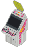
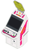

All images have been resized to make them the same size as the 128px version, otherwise they look like the two images below.
![]()

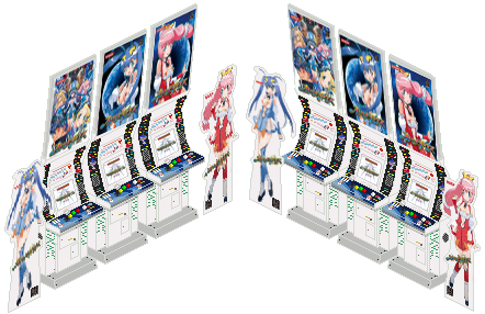
Front View, Rear View, One Player, Two Player Six Buttons (Three Plugged), Two Player Six Buttons, Horizontal and Vertical monitor layout versions.

Front View, Rear View, One Player, Two Player Six Buttons (Three Plugged), Two Player Six Buttons, Horizontal and Vertical monitor layout versions.



The Cores from four of the main games.
Gradius |
||
 |
 |
 |
Gradius II ~GOFER no Yabou~ |
||
 |
 |
 |
Gradius III ~Densetsu kara Shinwa e~ |
||
 |
 |
 |
Gradius IV ~Fukkatsu~ |
||
| None | None | None |
Gradius V |
||
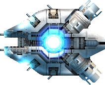 |
 |
 |
Player ships from various games in the series including ships from Salamander and Parodius.
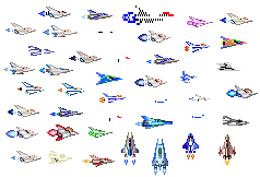
This was something I threw together when I first started the site back in 1997.
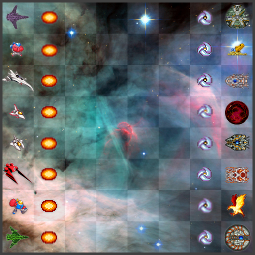
A little idea for which ships should be which piece in a game of chess.
