![]() John Smith Legacy
John Smith Legacy ![]() Gradius Home World
Gradius Home World ![]() GameStone
GameStone ![]() Follow @JimStoneCraft
Follow @JimStoneCraft
Konami is a Japanese entertainment, video game and gambling holder company located in Ginza, Chūō, Tokyo.
Ffounded on 21st March 1969, by Kagemasa Kōzuki in Osaka, stating him with his two co-founders' surnames of the company's name: Kagemasa Kozuki, Yoshinobu Nakama and Tatsuo Miyasako.
If you take the first two letters of their names you get the word KO NA MI
Over the years Konami has changed it's logo design, here are four of the main logo designs.
I like "2nd logo" the best (1986 - 1998)
Designer: Unknown
Typography: Helvetica (Modified)
Launched: March 1981
If you look at the logo letter "K" it is very stylised almost making another letter "I", Kionami.


Designer: James Cross by Cross Associates
Typography: Univers Black Italic
Launched: August 1986
James Cross - https://a-g-i.org/design/ucla-catalogue/
Konami introduced the new "bacon strips" logo which would be used until 2003.
The text on the bottom was given a new font (Univers Bold) became all-uppercase and italicize, coloured gray or black, the logo was sometimes placed in a boxed frame as shown below.
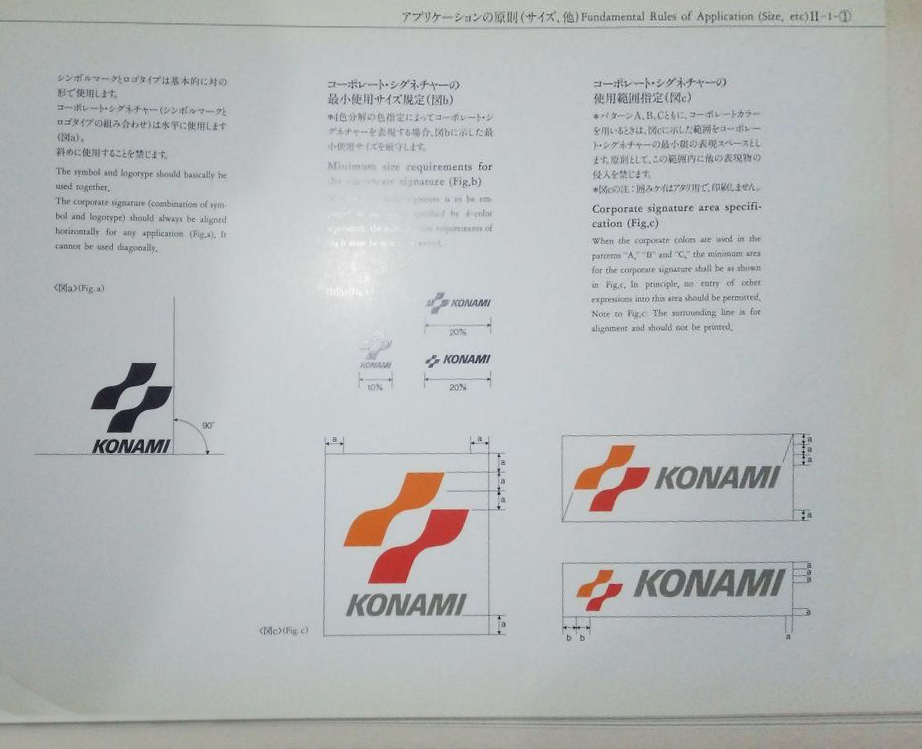
コナミロゴの幾何学と構造
Geometry and structure of the Konami logo
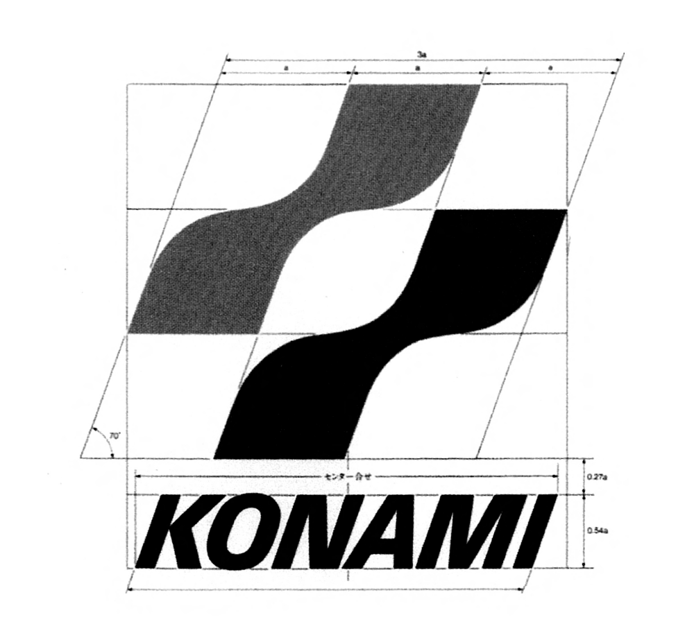
センター介せ
Se n taa kai se
Sentaa kaise translates as Centre or Centralized
As with any corporate company logo, they have a specification for designer to follow to keep the company assetts consistant.
These would have to be followed by internal devisions when making games, box art and anything else that would use the company logo.
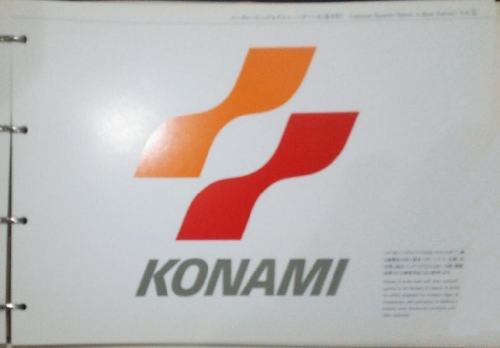
Designer: James Cross
Typography: Univers Black
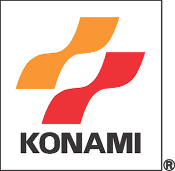
Launched: October 1998
Next Konami changed the text colour to black and straightened the text upright, like it previous version an optional boxed frame is sometimes used.
This logo was used in tandem with the next logo for certain games all the way to from mid to late 2003, this logo text is still being used on the card backs for the Yu-Gi-Oh! Trading Card Game.

Designer: Unknown
Typography: Optima Pro Bold (Modified)
Launched: April 2003
Konami introduced a new logo, although the previous logo continued to be used in tandem with it for certain games until late 2003. This logo consists of a knife-shaped banner with the word "KONAMI" in it. This logo is still in used by the Konami Sports Club.
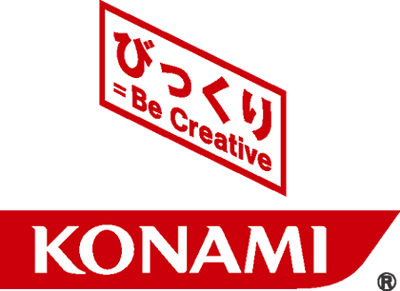

Designer: Unknown
Typography: Optima Pro Bold (Modified)
Launched: April 2003
Hex color: #bf0021
RGB: 191 0 33
CMYK: 0 100 83 25
Pantone: PMS 485 C
In 2013, the knife-shaped banner was removed, leaving only the wordmark from the previous logo. This variant was originally used for corporate purposes from 2003 to 2013 but is now used in all games.

Supplied by JUN